Overview
Opslyft is an AI-powered FinOps platform that helps cloud-native businesses gain visibility, control, and intelligence over their cloud costs. As the product matured and the company began engaging more enterprise customers, it became clear that the existing brand and experience no longer reflected the platform’s true capabilities.
This project focused on reimagining Opslyft’s brand, website, and visual language to support go-to-market goals, improve first-time user understanding, and position the product as an enterprise-ready FinOps solution.
The Challenge
The earlier version of Opslyft struggled to communicate clarity, trust, and value; especially to new and enterprise users.
Key challenges included:
A light-themed interface with poor visual hierarchy, making complex FinOps data difficult to scan and interpret
An unintuitive product UI that created friction for first-time users and no brand identity
Overly technical and dense content that failed to guide users through the product’s value
Marketing visuals that relied heavily on raw product screenshots, mirroring the same UX issues present inside the platform
As Opslyft evolved its offering and GTM strategy, these issues began impacting sales conversations and user perception. The founders decided it was time to reposition the brand to better reflect the product’s intelligence, maturity, and ambition.
Goals
The rebrand was driven by both business and user experience goals:
Improve first-time user understanding of FinOps concepts and product value
Elevate trust and credibility for enterprise buyers
Simplify the presentation of complex data and workflows
Establish a scalable, consistent visual language across product, website, and GTM assets
Leading brand exploration and visual direction
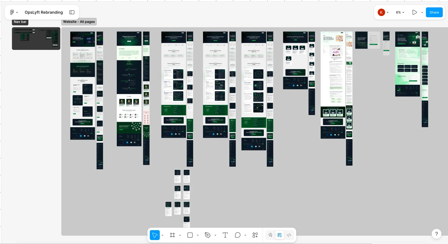
Redesigning the marketing website
Defining the visual language and UI principles
Collaborating closely with founders, product managers, and engineers
Ensuring consistency across brand and website.
Helped reposition Opslyft as an enterprise-ready FinOps platform
Created a consistent visual language across product, website, and GTM assets
Improved clarity and usability for first-time users
Enabled sales and GTM teams with clearer messaging and stronger visual credibility
This project reinforced the importance of aligning brand, product, and business strategy. A rebrand is not just about aesthetics — it’s about reducing friction, building trust, and helping users understand value faster, especially in complex B2B products like FinOps platforms.

Design Approach
1. Repositioning the Brand
The first step was to shift Opslyft’s perception from a basic cost-reporting tool to a strategic FinOps platform built for modern, cloud-first teams.
The new direction focused on:
Confidence over minimalism
Clarity over raw data dumps
Intelligence over aesthetics-only design
2. Visual Language & UI Foundations
I introduced a stronger visual hierarchy, improved spacing, and a more intentional use of color and typography to reduce cognitive load. The design system emphasized:
Clear information hierarchy for complex financial data
A more mature, enterprise-friendly color palette
Consistent components that could scale across product and marketing
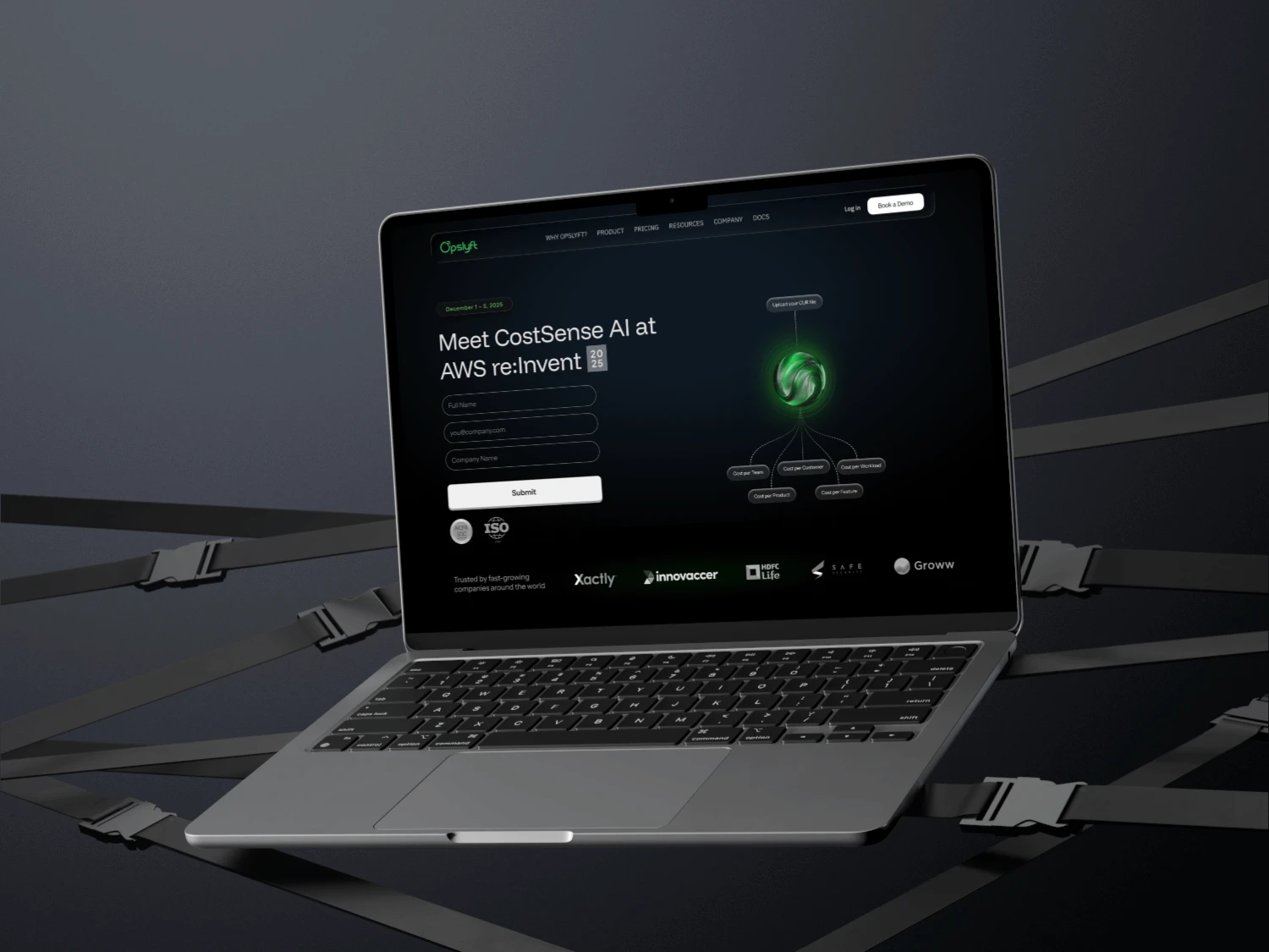
3. Website & Content Simplification
The website was redesigned to:
Clearly communicate Opslyft’s value proposition within seconds
Break down complex FinOps workflows into understandable narratives
Replace raw dashboard screenshots with curated, contextual visuals
Guide users through the product story rather than overwhelming them with features